DynavinStore is a U.K based company that supplies navigation systems, cameras, DVD screens, accessories and spare parts for high-end cars such as Mercedes, BMWs, Porsches and Audis. They have a niche clientele and exclusive branding.
DynavinStore appeals to a very exclusive market. They wanted their Magento website to reflect this exclusivity. They wanted their website’s category list re-mastered to ensure that their customers don’t have to struggle with navigation, the dealers had to be highlighted, FAQs had to be added and a high-end gallery page for each category needed to be created.
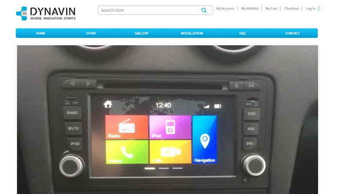
Juicebox gallery feature for each category
We wanted the product images for each category to look more exclusive and professional. Through the juice box feature, we gave a new look to the gallery page by displaying the product in high-resolution images instead of the standard thumbnail feature.
The juice box feature enables customers choose the brand they require in the gallery page and view exactly how the product will feature on their car. It also showcases the seller’s products in a unique, eye-catching manner that is reflective of his brand’s high quality.
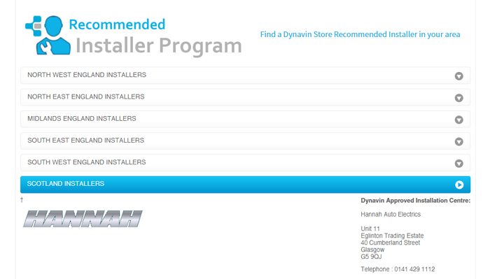
Dealer List Drop Down for instant information
Dynavin’s car systems need to be professionally installed by specialists. We realised that this information is important to buyers. Through a dealer list drop down, we displayed installer information according to area.
The buyer can locate a dealer in his/her area through a clearly displayed dealer list. We enabled Dynavin to guide their customers through a purchase efficiently from start to finish through the dealer list drop down.
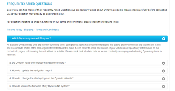
Redesigned FAQ Layout
Dynavin store’s previous FAQ layout was difficult to read and took a customer several scrolls to cover the entire section of questions and answers.
We wanted to give Dynavin store a smarter FAQ section by placing all the questions in just one fold with a drop down answer for each. This was done so that the visitor can view the answer to the question he/she has and not to all the questions as it was before. This enhances the user experience by helping the visitor find answers quickly.
Mobile and Tablet optimised
Desktop shopping is steadily decreasing! More people prefer to shop on-the-go and 50.3% of e commerce traffic is from handheld devices. It is absolutely crucial that a seller must consider this large and growing segment of mobile shoppers.
By making Dynavin Store’s Magento website mobile and tablet friendly, we provided every visitor and customer a quick and easy shopping experience. Important purchase-relevant information and images were displayed prominently, reducing the chances of page abandonment and increasing the chances of conversions. No shopper wants to pinch, scroll and zoom too much. This is a bad shopping experience. We eliminated this risk by making their Magento store mobile and tablet compatible and suitable for any device, configuration or platform in the world.
If you want a functional website that establishes your brand presence or if you want to generate more leads and traffic with a pixel perfect Magento website, leave it entirely to us. We will handle it for you from start to finish! Call us at +44 (161) 408- 3726 (UK) or drop us a line at sales@dzine-hub.com We would love to hear from you.


Be the first to leave a comment. Don’t be shy.