Atlas Craft, as their tagline suggests, is truly ‘A world of creative crafts.’ They are a family run business from the northwest of England and their family has been in the business for 130 years. The current owners are the 4th generation and have been in business for 45 years. This business’ lineage is truly fascinating, and their products stand up to their mark.
“Sew much fabric… sew little time…”
Atlas Craft was an established eBay business with a 99.9% positive feedback score on over 20,000 ratings. We knew straight away this would be a great business to work with.
The requirements: Michael Aldous (Owner, Atlas Craft) was introduced to us by Sarah Woodjetts (Director, Ecommplish) and approached us with a view to getting his eBay store revamped with new branding. Initial discussions progressed swiftly, and we commenced drawing up the initial design preview within 2 days of our first conversation!
An eBay store homepage with clear navigation options is essential

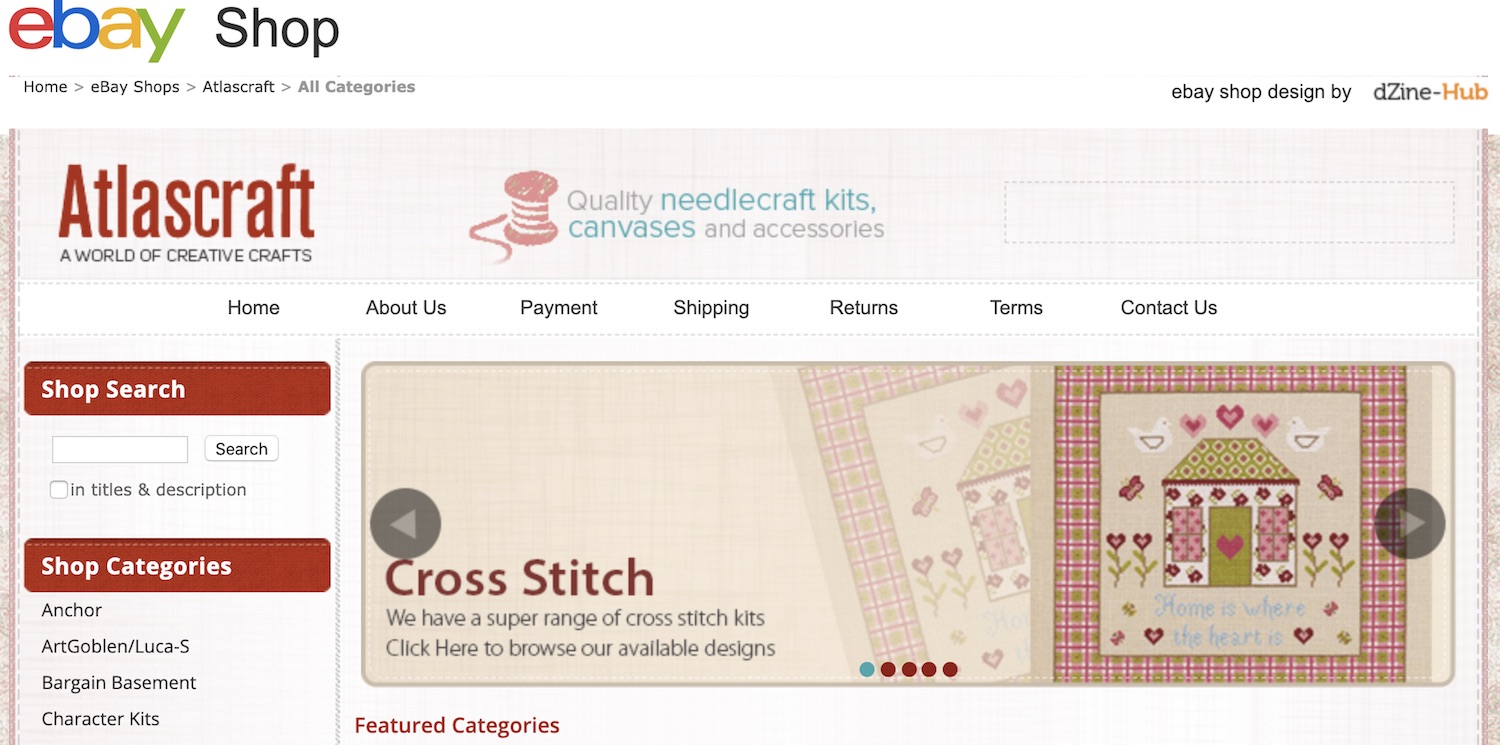
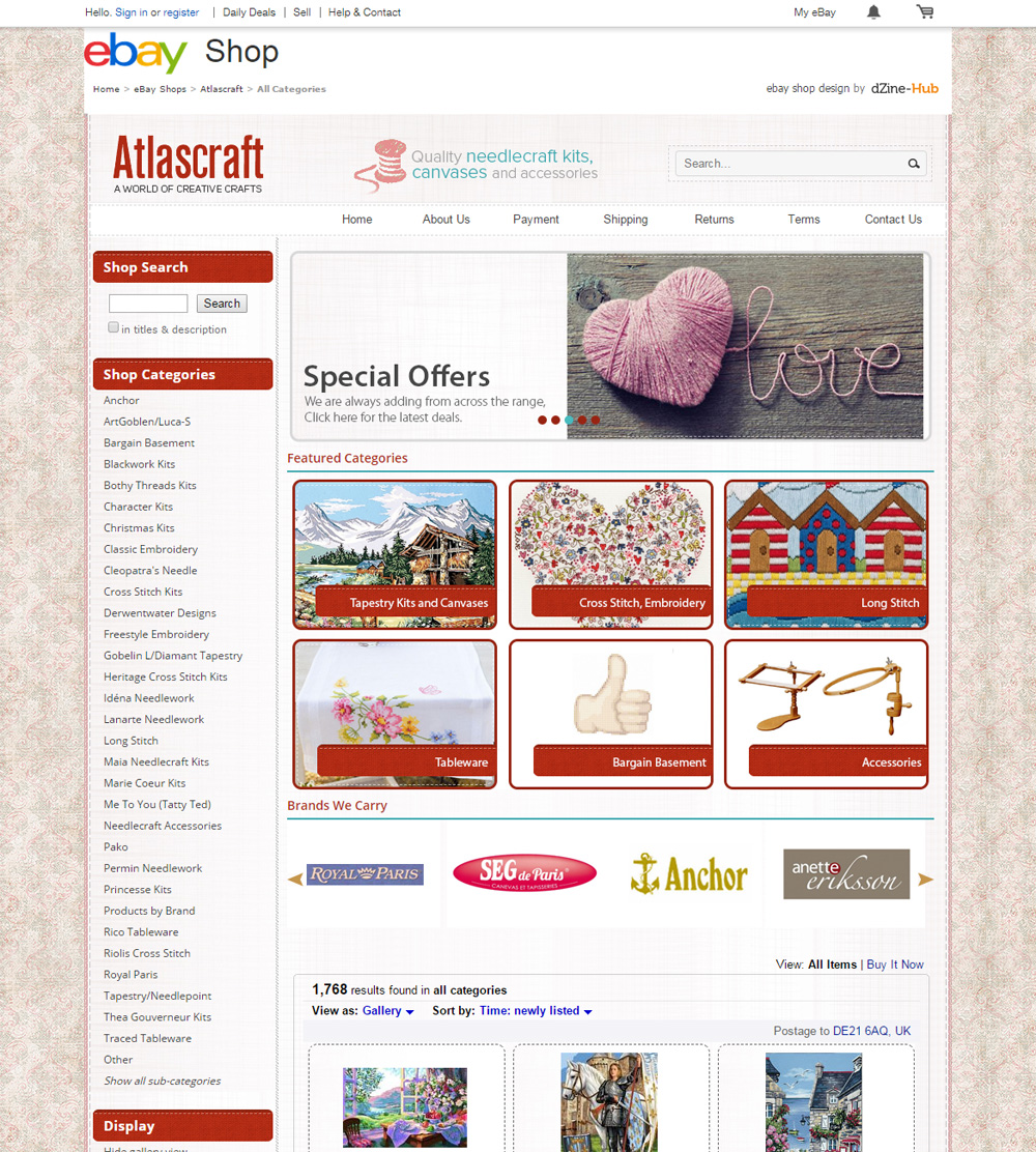
A boring ebay store homepage with random items displaying is a great way to chase away customers. The customer would love a general idea of what they can find on the store – we communicated this with a banner carousel and image category boxes to highlight the store’s main line of products, with a comprehensive list of store categories on the left column for easy access, and keeping with the layout eBay customers are used to.
Opportunity to showcase the different brands
Sometimes, the customer identifies with a particular brand and wishes to see items from that brand specifically. Instead of displaying a full list of brands occupying a lot of space, we achieved this with what we call a “brand scroller”.
This has the brand logos auto-scrolling; it allows the customer to click and be led to a section that only offers products from one specific brand of their choice.
Avoiding re-work – Dynamic store categories on the listings
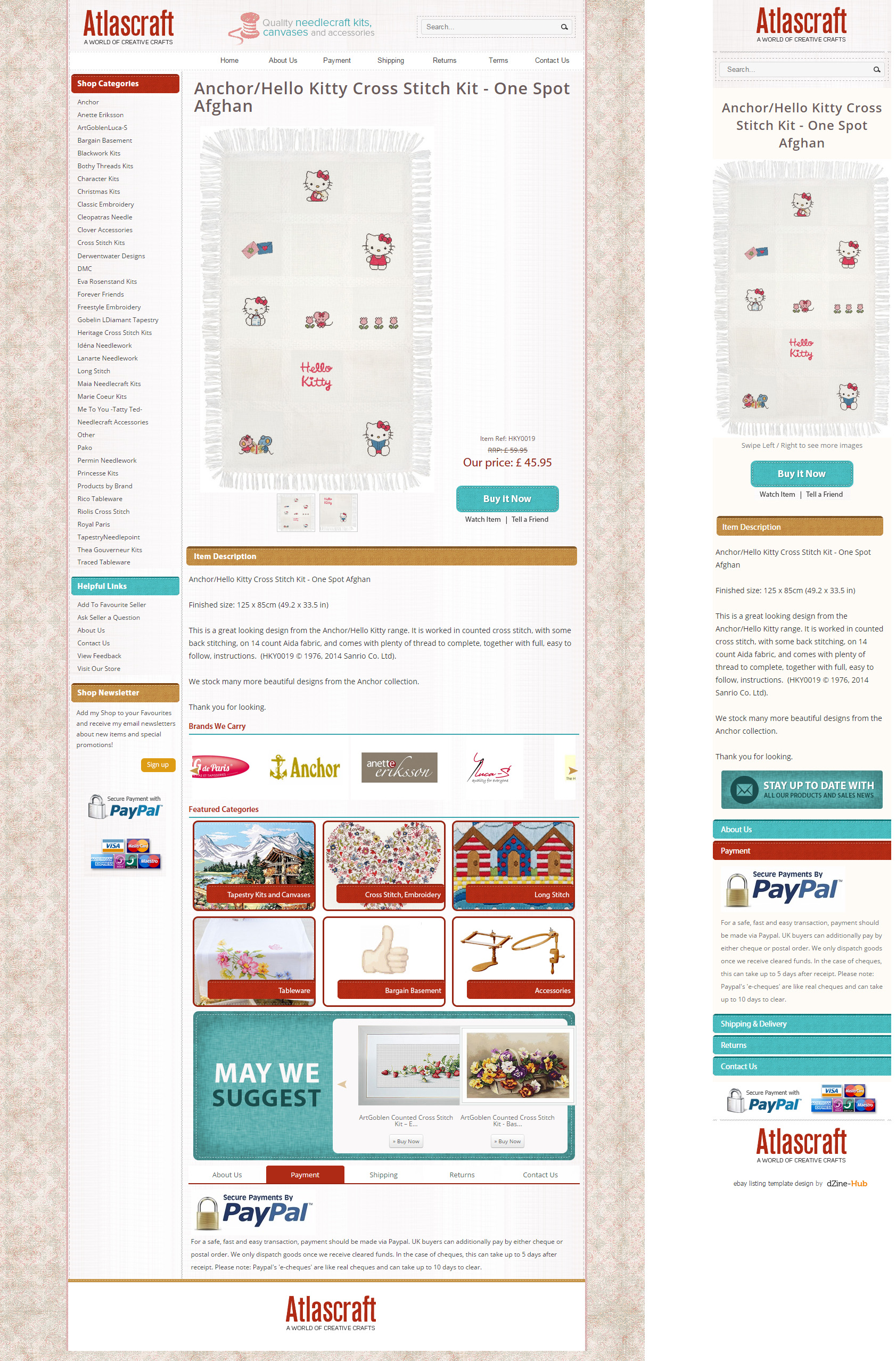
We submitted a listing template HTML file to use with the description section of each listing, and this has the store categories displayed on the left column. Take a look at this item on Atlas Craft, that uses our custom designed listing template – http://www.ebay.co.uk/itm/271870890888. By default, any additions, removals or modifications to the categories on the eBay store will not reflect on the category list on the listings using the designed template, as this is static HTML.
Ideally, if you add a store category or remove one at some point in the future, you want the changes reflecting everywhere where the category list is present, to avoid confusion or links that just don’t work anymore. Therefore, we made this section of store categories on the listing template completely dynamic, in that it always displays the updated list of store categories on all active items using the listing template.
It sure saves a lot of time when compared to manually editing each individual listing to update the category list, especially when your inventory list runs in hundreds!
Mobile responsive listing template

(not shunning mobile traffic – welcoming them!)
The number of customers viewing items on eBay via mobile phones was estimated at 56% in May 2014, and is only displaying an upward trend since. We viewed the description template initially on a mobile phone, and saw that it wasn’t exactly optimal – the entire template loaded up on a small mobile screen, in a shrink-to-fit effect with the customer needing to zoom in, move left and right to view the actual description of the item.
We then did the smart thing – we made the listing template mobile responsive. This gives you the best of both worlds; it displays the full version when you view it on a computer screen, and a stripped down, mobile optimized version when you view the description on a mobile phone. The font sizes and overall layout is built for optimal viewing on mobile phones, with multiple images displaying on swipe. That apart, the listing template was coded with clean html. The advantage of using clean html code in eBay descriptions is that it helps rank listings higher since eBay uses clean code as one of the search results ranking factor.
Advanced Multiple Image Galleries with ChannelGrabber
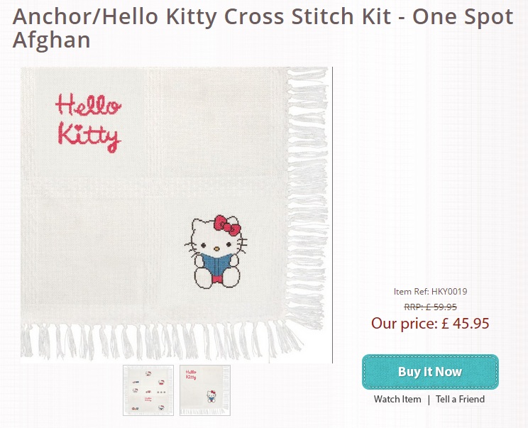
It’s always best to display more than one product image for every listing. We coded an advanced gallery to showcase the multiple images as thumbnails below the main product image inside the description template.
Atlas Craft is using ChannelGrabber to manage their eBay inventory, orders and overall stock control across their different channels. We customised our listing template to fit seamlessly into ChannelGrabber, along with tokens for the multiple images per listing. All Michael needs to do now is upload the multiple images as normal on an eBay listing through ChannelGrabber, and the images would automatically appear in the description as the advanced image gallery.
Cross promotion – driving traffic to the store
Buyers first reach the item listing pages on eBay, and then traverse to the eBay store. We added cross promotional features on the listing template as incentives for the buyer to go to the eBay store – direct links to other items from the same store category as the one being viewed, featured image category boxes, the brands scroller et al. All these tell the buyer there’s more, they need to get on to the Atlas Craft eBay store.
Michael was a joy to work with throughout the project. We asked him in the end if the design had a positive impact on business, here’s what he had to say –
“Fantastic store… Fantastic results”
If you would like to get your eBay sales looking further upwards, please get in touch to see how our ebay design services could positively impact your business. Contact Us now.


